The Most Expensive Logos in the World
Not everyone is aware of the costs involved in creating a logo. While most people have a general idea of the price of branded products like Nike sneakers or Levi's jeans, few realize the expensive and highly profitable process of designing a logo.
A simple logo can be both incredibly costly and a powerful marketing tool. Just think of McDonald's. The fast-food chain's golden "M" is recognized worldwide, and their unmistakable Golden Arches logo attracts customers wherever they go.
The Most Expensive Logos and Their Prices
The most expensive logos are not always the most obvious, but they often reflect the scale and wealth of the companies behind them. Here’s a list of the 10 most expensive logos in the world:
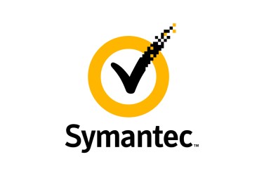
1. Symantec Brand & Acquisition – $1,280,000,000
Spending over a billion dollars on a logo might seem excessive, no matter who it's for.
However, in 2010, Symantec Endpoint Protection acquired the VeriSign checkmark, which cost them an astonishing $1.28 billion.
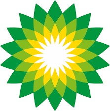
2. British Petroleum (BP) Logo & Marketing – $210,000,000
British Petroleum’s (BP) globally recognized logo features a green and yellow flower-like Helios symbol. The goal was to create the impression that BP is committed to environmental sustainability and the fight against global warming.
3. Accenture – $100,000,000
In 2017, Accenture slightly modified its logo, now using the Rotis Sans Serif Extra Bold 75 font.
As a leading agency specializing in technology management and consulting, Accenture wanted a logo that would inspire consumers.
4. Posten Norge Rebranding – $55,000,000
Founded in 1647, Posten Norge, Norway’s postal service, is managed by the country's Ministry of Transport and Communications.
Through rebranding, the company increased its net revenue by about 13 million Norwegian kroner ($1.4–1.5 million).
The rebranding process in 2008 led to the creation of the logo still in use today.
5. ANZ Bank Logo – $15,000,000
When Australia and New Zealand merged their banking sectors, ANZ Bank adopted its current logo.
The symbol in their logo represents a lotus flower, with three elements (two leaves and one bloom) symbolizing Australia, New Zealand, and Pacific Asia.
6. BBC Logo Rebranding – $1,800,000
BBC’s logo is instantly recognizable among English speakers worldwide.
Originally designed in 1958, the current design has been in use since 1997. Recently, BBC refreshed its logo again, but many noted that the changes were minimal.
The simplicity of their black-and-white branding makes it both easy to identify and impactful.
7. Citibank Logo – $1,500,000
Citibank, a subsidiary of Citigroup, operates 2,649 branches in 19 countries.
The bank’s current logo was created in 1998 and cost $1.5 million.
8. Pepsi Logo Redesign – $1,000,000
Pepsi, Coca-Cola’s biggest rival, has consistently used a red and blue color palette.
The original solid red Pepsi-Cola logo was modified in 1950, incorporating blue to reflect American patriotism after World War II.
The current, simplified Pepsi Globe logo was designed in 2008.
9. London 2012 Olympics Logo – $625,000
It’s no surprise that one of the world’s most expensive logos was designed for the Olympics.
The London 2012 logo faced criticism for its complex style, but it certainly stood out.
The design features the numbers 2012, stylized in angular geometric blocks, with the word London and the Olympic rings integrated into the design. It was created by Wolff Olins, the agency behind logos for TikTok, Tesco, and Uber.
10. City of Belfast Logo – $280,000
It may seem unusual, but cities also have their own logos.
Belfast’s heart-shaped logo was meant to represent vibrancy, inclusivity, and a welcoming atmosphere.
Despite being an expensive investment, this logo wasn’t used for long.
Is It Worth the Investment?
Spending hundreds of thousands—or even millions—of dollars on a logo is debatable.
However, one thing is clear: a strong visual identity is crucial for companies that want to be taken seriously.
At BrandOn marketing and branding agency, we are ready to help you create the ideal, effective logo—from concept generation to final execution.