Fanta’s New Rebranding
Coca-Cola’s design team and the creative agency Jones Knowles Ritchie have redesigned the Fanta logo, giving it a more playful and fun identity. Read more about the rebranding in today’s Brandon blog.
The goal of the rebranding was to give the brand a fresh, playful character that appeals to people of all ages.
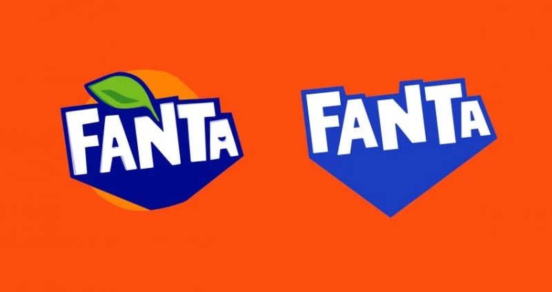
Old vs. New Logo
"Fanta is one of the most joyful brands in our portfolio. However, it was clear that the brand needed some refreshment because the old logo was too restrained and didn’t capture the cheerful energy that Fanta promises," says Rafa Abreu, Global Vice President of Design at The Coca-Cola Company.
"At the same time, it was previously aimed at a younger audience. But in reality, our consumers are anyone young and playful at heart. It was important to ensure that the idea of fun and playfulness was also communicated to older audiences," he adds.
The rebranding simplified the previous logo, creating a clean, flat design. The letters were refined, shadows were removed, and the smile-shaped accent on the second ‘A’ was eliminated. The bold drop shadow was replaced with a lighter shade of blue, extending downward to form a dot.
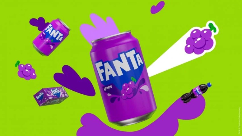
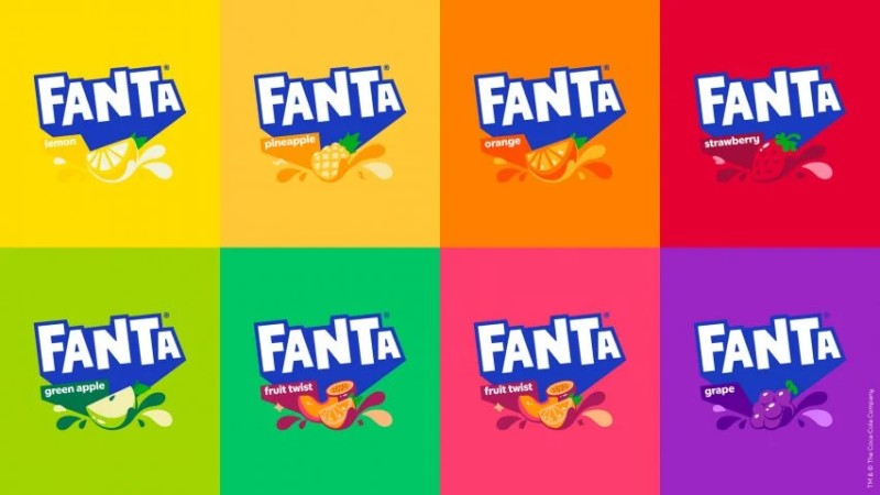
Since the logo will be used across Fanta’s diverse flavor range, the design team removed the orange circle and leaf, which were part of the old logo. This change was also driven by the brand’s flavor expansion, as Coca-Cola introduced new varieties beyond the traditional orange Fanta. The old logo’s orange imagery often confused consumers and didn’t match the label colors of different flavors.
That’s all for today’s Brandon blog! Stay tuned for more updates, and don’t forget to check out our post “The Evolution of Famous Brand Logos”.