Johnson & Johnson Rebranding
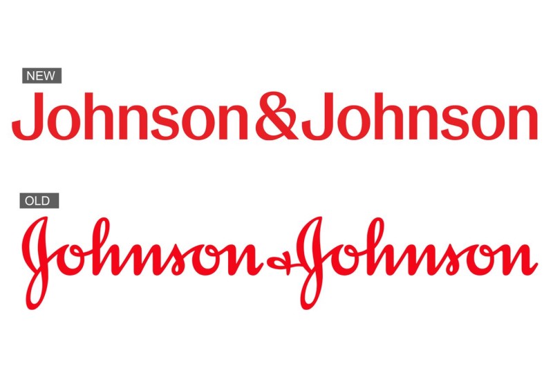
The iconic, distinctive logo that Johnson & Johnson had been using since 1887 has been replaced with a more modern design, focusing primarily on the pharmaceutical sector and medical equipment.
More than 130 years ago, when James Wood Johnson founded Johnson & Johnson, his signature was used as the company’s emblem. What led the company to reconsider and change its emblem? Today, we will try to uncover this in BrandOn's blog.

The recent changes include renaming Janssen's pharmaceutical division to Johnson & Johnson Innovative Medicine, while the brand will continue its operations in the company’s medical technology sector, now called Johnson & Johnson MedTech. J&J’s consumer business, which includes brands such as Band-Aid, Listerine, and the well-known baby shampoo, will operate under the name Kenvue. Kenvue’s products will retain the Johnson & Johnson name and old logo for some time until the old product line is fully replaced with the new brand, developed by Wolff Olins.
The announcement of the logo change sparked widespread discussions online, as the new emblem has no resemblance to the previous one, which carried over a century of history. The assumed reasons behind the rejection of the original logo vary, ranging from Johnson & Johnson’s desire to distance itself from recent lawsuits claiming that its baby powder could cause cancer (something the brand denies, insisting on its safety). However, it is more likely that this is yet another example of how a brand is adapting to digital transformation and wants the logo to be effective on social media platforms.
According to information published on the company’s official website, the brand hopes to draw more attention to the shortened "J&J" form, making it more presentable and modern. The only element retained from the old branding is the red color. Johnson & Johnson’s new logo aligns with current pharmaceutical design trends, which can also be observed in Kenvue’s signature style (again, designed by Wolff Olins). This serves as a visual signal that the brand has changed.
But was abandoning a 136-year-old, globally recognized logo truly the right decision? That remains a question, and only time will tell the answer. Stay tuned to BrandOn’s blog for more exciting news from the digital world, and check out our article "Pepsi’s First Rebranding in 14 Years."


