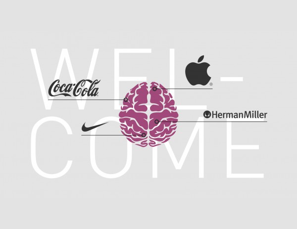

When we say “blue logo,” we also feel something — trust, calmness, stability. Red? That’s fire, movement, energy. Colors affect people just like music does — sometimes consciously, sometimes subconsciously.
No matter how much we love the color yellow, it doesn’t mean it belongs in the logo of a financial company. Branding isn’t about liking or disliking something. It’s a choice that a professional branding agency must make — based not on aesthetic taste but on the essence of the brand, its market position, and how the audience perceives visual cues on a psychological level.
For instance, a vibrant orange might work perfectly for a fast food brand, yet feel completely out of place for a healthcare company.
Shapes say more than you think
Lines speak — if you’re willing to listen. Curved edges say, “It’s safe here, come closer.” Sharp angles signal strength, determination, and energy. That’s why athletic brands lean into aggressive, dynamic forms, while kids’ product brands favor soft, friendly shapes.
Logo design is like a translator — it transforms your values and goals into something visual. And when it’s done right, words become secondary. Recognition becomes instant.
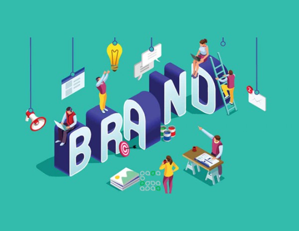
A logo is an investment, not just a detail
Think about it: your logo shows up on your website, Instagram, packaging, brochures, business cards, and even on your employees’ uniforms. It’s your brand’s presence, everywhere.
That’s why a well-designed logo is not just a nice image — it’s a marketing asset. As valuable as your website, advertising, or any customer-facing touchpoint.
A strong logo is memorable without effort and reflects your brand exactly as you want it to be seen. If that’s what you’re aiming for, trust the professionals who can tell your story through color, shape — and without a single extra word.